.ppix file and data used in this blog can be found in this GitHub linkWhat is a Power BI Dashboard? Link to heading
Power BI has become the go-to platform for connecting, transforming, and visualizing data from various sources. Its dashboards offer a powerful, intuitive way to interact with and explore data. The best part? Power BI is not just for data scientists—it’s designed to be user-friendly, even for those without a deep analytics background.
One standout feature of Power BI dashboards is that they dynamically update as data changes, ensuring the most critical information is always up-to-date. This makes them perfect for quick insights and informed decision-making.
In this blog, we’ll explore essential principles for designing effective Power BI dashboards. We’ve collected three simple Power BI dashboard examples along with their corresponding datasets. We’ll discuss common issues found in dashboards and how to improve them. Before diving into design tips, let’s first review the existing dashboards and the transformations we made to correct visualization mistakes.
Creating a Power BI dashboard isn’t just about having accurate data; it’s also about designing it in a way that’s easy for stakeholders to understand. A well-crafted dashboard helps institutions make smart decisions quickly. On the other hand, a poorly designed dashboard, even with accurate data, can be frustrating and ineffective.
Sales Dashboard Link to heading
The Sales Dashboard offers a comprehensive snapshot of sales performance, tracking key metrics like yearly, quarterly, and monthly sales, as well as sales by region. It’s crucial for Predictive Sales Forecasting, using AI and machine learning models to predict future sales based on historical data and external factors. Additionally, it supports Real-Time Sales Tracking by integrating with live data sources, allowing users to monitor sales as they happen.
Customer Segmentation Dashboard Link to heading
This dashboard breaks down the customer base by demographics, purchasing behavior, and other key factors. Such segmentation helps customize products, services, and marketing efforts, targeting specific groups to boost engagement. It’s also useful for Churn Prediction, allowing you to identify customers at risk of leaving and implement strategies to retain them.
Product Sales Dashboard Link to heading
The Product Sales Dashboard is great for identifying top-selling products, managing inventory, and making informed decisions about pricing or promotions. It allows users to compare sales channel performance against previous years, providing valuable insights into trends and helping businesses make strategic adjustments.
However, after examining these dashboards, you may notice issues like incorrect figures or ineffective visualizations. In the following section, we’ll analyze these issues in detail and discuss how to improve them for better clarity and functionality.
1. Wrong Chart Implementation Link to heading
Choosing the right type of chart is crucial for clearly communicating your data. Using the wrong chart can lead to confusion and misinterpretation, potentially leading to poor decisions. It’s important to pick a chart type that fits the nature of your data and the message you want to convey.
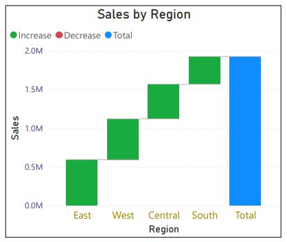
For example, the customer segmentation dashboard currently uses a waterfall chart to display the distribution of sales across different regions. This type of chart is designed to illustrate how an initial value changes through a series of positive or negative contributions, ultimately reaching a final value. However, in this case, which focuses on analyzing sales across different regions, a bar chart or pie chart would be more appropriate.
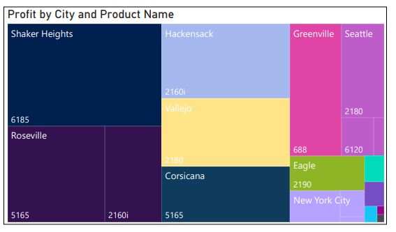
Similarly, the product sales dashboard uses a Treemap to show profits by city and product name. While Treemaps can display the relative sizes of categories, they are not ideal for comparing large and many categories, or handling multiple values like profit, city, and product. A stacked bar chart would be a better choice for showing sales data clearly.
2. Unnecessary Volume of Data Link to heading
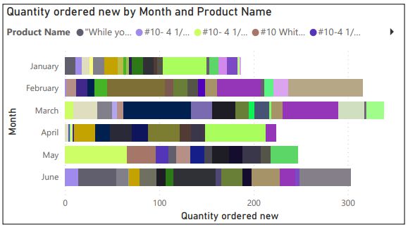
Displaying too much data in a single chart can overwhelm viewers. For example, a pie chart with too many categories becomes unreadable, and other charts can suffer from the same issue. It’s crucial to simplify data presentation to ensure clarity.
3. Indistinguishable Colour Scheme Link to heading
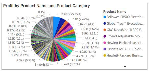
Color schemes play a big role in helping users quickly understand the data. However, if the colors are too similar, they can cause confusion. In the product sales dashboard, for example, similar colors make it difficult to distinguish between products. A more contrasting color palette would greatly improve readability.
To address the issues identified earlier, we’ve revised the dashboards to improve their accuracy and usability. Here’s a closer look at the updated versions:
Revised Customer Segmentation Dashboard Link to heading
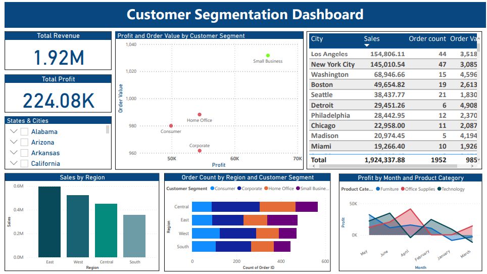
Revised customer segmentation dashboard
In the updated dashboard, we focused on providing clear insights into customer segment performance. Key improvements include:
- Cards: Display key statistics like total revenue and profit. These are interactive, allowing users to apply filters, such as state or city, for more specific data.
- Scatter Chart: Plots profit and order value by customer segment to help identify trends and correlations.
- Table: Displays city data, aiding in performance comparisons.
- Slicer: Allows filtering by state and city for focused analysis.
Revised Sales Analysis Dashboard Link to heading
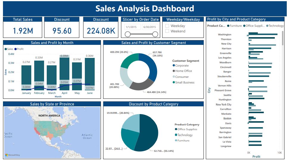
Revised Sales Analysis dashboard
This redesigned dashboard offers a more detailed view of sales metrics and product performance. Key updates:
- Cards: Show sales figures, profit, and discounts for a quick overview.
- Slicers: Allow detailed filtering by order date and differentiate between weekdays and weekends.
- Clustered Bar Chart: Compares product category data by city.
- Pie Charts: Visualizes discount percentages by product category, and Sales/Profit by Customer Segments.
Revised Product Sales Dashboard Link to heading
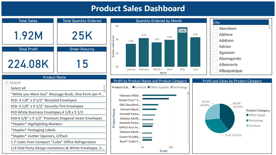
Revised Product Sales dashboard
The redesigned product sales dashboard emphasizes clarity:
- Line and Stacked Column Chart: Highlights trends in product orders each month.
- Clustered Bar Chart: Replaces the Treemap, offering easier comparisons of profits by product.
- Pie Chart: Visualizes sales and profits by product category, with additional data as tooltips for better insights.
Conclusion Link to heading
Designing an effective Power BI dashboard goes beyond simply displaying accurate data. It requires thoughtful decisions on chart types, color schemes, and data volume to ensure that the information is easy to understand and actionable. By making these improvements, we can transform confusing dashboards into valuable tools that provide clear insights and support better decision-making. Whether it’s tracking sales, segmenting customers, or analyzing product performance, the right dashboard design empowers businesses to make informed, data-driven choices.