Overview Link to heading
In today’s data-driven world, leveraging data for informed decision-making is crucial. A user-friendly dashboard plays a vital role in achieving this goal. If you’re new to Power BI or looking to refine your skills, I recommend checking out my previous blog post, Power BI Tutorial: Tips for Clear Data Visualizations. In that post, I covered essential principles of designing effective Power BI dashboards, common issues to avoid, and practical tips to enhance your visualizations. It’s a great resource to get a comprehensive understanding of Power BI’s capabilities and best practices.
In this blog we will explore how to build a Power BI dashboard using OLIST e-commerce database. We collected the datasets from Kaggle
Before we get started, here is what the final dashboard looks like:
Data Source: A Peek into the Dataset Link to heading
OLIST is the largest department store in the Brazilian e-commerce marketplace. Their publicly available database contains retail datasets of 100k orders placed on Olist, spanning from October 2016 to September 2018 across several states.
To summarize, the data covers order details, customer details, product details, seller details, payment details, geolocation details, and review details. It includes information on prices, orders, order statuses, payments, freight, and user reviews, among many other parameters. It consists of almost 100,000 customer IDs and order IDs.
The database schema model is shown below to help understand how the data interrelate with each other.
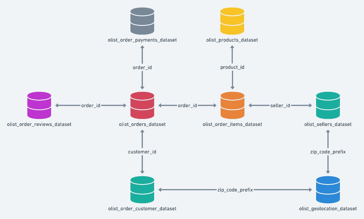
Entitiy-relationship model diagram of Olist Dataset
Data Quality: Exploratory Data Analysis (EDA) in Python Link to heading
Before diving into Power BI, it’s crucial to familiarize ourselves with the data. I typically start by reviewing the data dictionary, and a quick glance at the CSV or Excel file. Then, I get to my favorite part: Exploratory Data Analysis (EDA) in Python. EDA helps uncover insights about the distribution of incidents, identify patterns, and categorize the data. In this case, we’re working with nine different CSV files.
First, we’ll assess data quality to gain a comprehensive understanding of our dataset. This involves examining various attributes and planning our next steps. While large datasets can be daunting, Python makes this process more manageable.
To profile the data, we can either use a profiling library or write custom Python code. Here’s a quick example using the Pandas, and Pandas Profiling libraries:
# Summary of the DataFrame
df.info()

# Descriptive statistics
df.describe()

# Check for missing values
df.isnull()

# Data types of each column
df.dtypes

# Correlation matrix
df.corr()
import pandas as pd
from ydata_profiling import ProfileReport

df = pd.read_csv("olist_customers_dataset.csv")
profile = ProfileReport(df, title="Profiling Report")
profile.to_file("olist_customers.html")
The Pandas Profiling makes life super easy. The HTML file you’ll get contains all the crucial details you need. Just read through it to figure out the next steps, paying attention to any missing, inaccurate, or invalid data.
In the Olist datasets, the profiling report showed:
1. Some missing or null values. 2. Incorrect data formats.
Luckily, this dataset seems pretty tidy and ready for visualization. But if it was messy (with outliers or missing values), I would clean it up in Python first to make sure it’s reliable before jumping into visualization.
With the data in good shape, we import it into Power BI and get started on the visualizations.
Data modeling Link to heading
Once we loaded the datasets into PowerBI, we can see that the raw data just has tables and keys referring to each file. So, we need to preprocess it to get some meaningful insights. Here’s what the initial data model looks like:
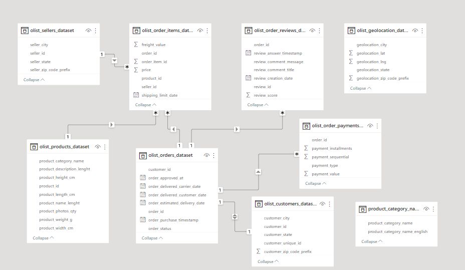
Model Before
At this stage, the tables aren’t connected properly, which limits our ability to leverage the data. For example, the olist_geolocation_dataset and product_category_names tables aren’t linked at all. Also, Power BI requires explicit time data to manage time-related aspects across tables effectively. It’s crucial to establish the correct relationships between tables, and of course, the variables need to be defined accurately as numerical, geographical, or textual data.
The table below shows the entity relationships used in our analysis:
| Entity | Relationship Type | Related Entity | Key |
|---|---|---|---|
| Sellers | One-to-Many | Geolocation | geolocation_zip_code_prefix |
| Sellers | One-to-Many | Orders | orderID |
| Sellers | Many-to-One | Brazil State | StateID |
| Brazil State | One-to-Many | Customers & sellers | StateID |
| Geolocation | Many-to-One | Sellers | zip code prefix |
| Geolocation | Many-to-Many | Customers | zip code prefix |
| Customers | One-to-One | Order Dates | customerID |
| Products | Many-to-One | Product Category | ProductID |
| Products | One-to-Many | Orders | ProductID |
| Orders | Many-to-One | Order Dates | OrderID |
| Order Dates | One-to-Many | Payments | OrderID |
| Order Dates | One-to-Many | Reviews | ReviewID |
| Order Dates | Many-to-One | Weekday | Date |
After linking these tables properly, we get a well-structured data model that looks something like this:
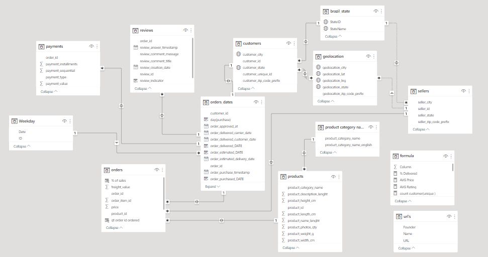
Model After_
DAX Formulas Link to heading
DAX, or Data Analysis Expressions, is a formula language used in Microsoft Power BI, Excel, and SQL Server Analysis Services (SSAS). It’s designed for data modeling and analysis, allowing users to create custom calculations on data models
In our report, we have developed multiple DAX formulas to enhance the functionality of our dashboard. This section will explore key tables in our dataset, which have been renamed for easier reference. This will help us build a comprehensive data model optimized for analytics.
Orders Table Link to heading
At the heart of our data model is the Orders table. It’s the most crucial component, detailing customer purchases of specific products. This table contains primary keys that are essential for extracting insights. I’ve created two DAX formulas: % of Sales to show the profit ratio, and Qt Ordered to count unique orders.
% of Sales = DIVIDE([price], SUM([price]), 0)
qt_order_id_ordered = DISTINCTCOUNT(orders[order_id])
We also introduced several other formulas to provide deeper insights:
% Delivered =
DIVIDE(
    (CALCULATE(COUNT(orders_dates[delivery_indicator]),
     orders_dates[delivery_indicator] ="on time" || orders_dates[delivery_indicator] = "in advance")),
    COUNT(orders_dates[delivery_indicator]))
AVG Price = AVERAGEA(orders[price])
count orders = COUNT(orders[order_id])
count orders(unique) = DISTINCTCOUNT('orders_dates'[order_id])
Geolocation Table Link to heading
The Geolocation table, now integrated into our data model, links geolocation information with customers and sellers. This connection allows us to derive postal codes, cities, and states for deeper insights. Additionally, we’ve created a hierarchy to enable drilling down from country to state to city.
Order dates Link to heading
This table enables chronological data analysis. In the orders_date table, we can track the time difference between orders and group them by order date to obtain indicators such as deliveries or purchases. We can drill down from year to quarter, month, and day. I’ve created a delivery_days DAX expression to calculate the difference in days between estimated and actual delivery dates.
delivery_days = DATEDIFF('orders_dates'[order_estimated_DATE],'orders_dates'[order_delivered_DATE],DAY)
Additionally, there’s a delivery indicator DAX formula to categorize whether the delivery was made before, on time, or after the estimated date. The formula is:
delivery_indicator = IF('orders_dates'[delivery_days]>0,"In advance",
    IF('orders_dates'[delivery_days]=0,
    "On time",
    "Late"
    ))
Together, these expressions allow us to assess the total number of days each delivery took and categorize the delivery performance effectively.
I’ve also added time_day and time_hour expressions to differentiate approval, delivery, and orders in days and hours, respectively.
time_day (approved vs delivered) = DATEDIFF(orders_dates[order_approved_at],orders_dates[order_delivered_customer_date],DAY)
Similarly, the time_hour expression will allow us to track the time difference in hours for more granular analysis of the approval and delivery process.
time_hour (approved vs delivered) = DATEDIFF('orders_dates'[order_approved_at], 'orders_dates'[order_delivered_customer_date], HOUR)
Review Table Link to heading
To generate meaningful product insights, I’ve added the review_indicator to determine if a comment was made after a purchase. This helps us understand customer sentiments and whether they share their experiences. The review_indicator categorizes reviews based on the presence of keywords, enabling us to identify common product descriptors.
review_indicator = IF(reviews[review_comment_message]=="" || reviews[review_comment_message]=="-","No Comment","With Comment")
We also introduced the average rating calculation:
AVG Rating = AVERAGEA(reviews[review_score])
Brazil State Table Link to heading
This new table includes state IDs and city names, and is modeled in a one-to-many relationship with both the Sellers and Customers tables. It enables us to focus our analyses within Brazil, leveraging its rich dataset while excluding data from other regions for a more detailed and descriptive analysis.
Additional DAX Formulas Link to heading
We further enhanced our analysis with:
count customer(unique) = DISTINCTCOUNT(customers[customer_unique_id])
customers count = DISTINCTCOUNT(customers[customer_id])
delivery less 19 days =
COUNTROWS(FILTER('orders_dates', 'orders_dates'[delivery_days] < -19))
delivery more than 100 days =
COUNTROWS(FILTER('orders_dates', 'orders_dates'[delivery_days] >= 100))
orders with an item =
VAR um = CALCULATE(DISTINCTCOUNT(orders[order_id]),FILTER(orders, [qt order id ordered]=1))
RETURN (
    DIVIDE(um, [count orders(unique)])
)
payment_value average per product_category_name_english =
AVERAGEX(
    KEEPFILTERS(VALUES('product category name translation'[product_category_name_english])),
    CALCULATE(SUM('payments'[payment_value]))
)
price total for product_category_name_english =
CALCULATE(
    SUM('orders'[price]),
    ALLSELECTED('product category name translation'[product_category_name_english])
)
qt of customers ordered =
COUNTROWS(SELECTCOLUMNS('orders_dates', "customer_id", DISTINCT('orders_dates'[customer_id])))
recurrent count = CALCULATE(
    DISTINCTCOUNT('orders_dates'[customer_unique_id]),
    FILTER('orders_dates', 'orders_dates'[recurrent] = "YES"),
    'orders_dates'[order_status] IN {"delivered", "shipped"}
)
recurrent customers ratio = CALCULATE(DIVIDE([recurrent count],[count customer(unique)]))
Total Grand Orders = CALCULATE(COUNT(orders[order_id]), ALL(Orders))
Total Grand Sales = CALCULATE(SUM(payments[payment_value]), ALL(payments))
Total sales =
SUM('orders'[price]) + SUM('orders'[freight_value])
Executive Insights Dashboard Link to heading
When it comes to answering “How are we performing?” it often leads to a series of follow-up questions, especially for global companies. To tackle this, I designed the first report to anticipates these inquiries, promoting data-driven decisions with a flexible and visually engaging dashboard.
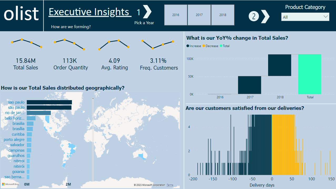
Executive Insights Dashboard
The Executive Insights page focuses on sales and customer data, aiming to meet goals, enhance customer satisfaction, and boost sales by revealing insights. We used three unique formulas to build this dashboard:
Total sales = SUM('orders'[price]) + SUM('orders'[freight_value])
count customer(unique ) = DISTINCTCOUNT(customers[customer_unique_id])
count orders = COUNT(orders[order_id])
Revisiting the figures, we see that São Paulo consistently leads in total sales. Despite a rapid increase in sales over the past three years, the waterfall graph shows no decline in values.
Interestingly, both late and early deliveries are significant. There are five orders that took more than 100 days to deliver, clearly impacting customer satisfaction.
Descriptive Analytics Dashboard Link to heading
Now, let’s dive into descriptive analytics. You can select a specific day, month, or year using the slicer at the top.
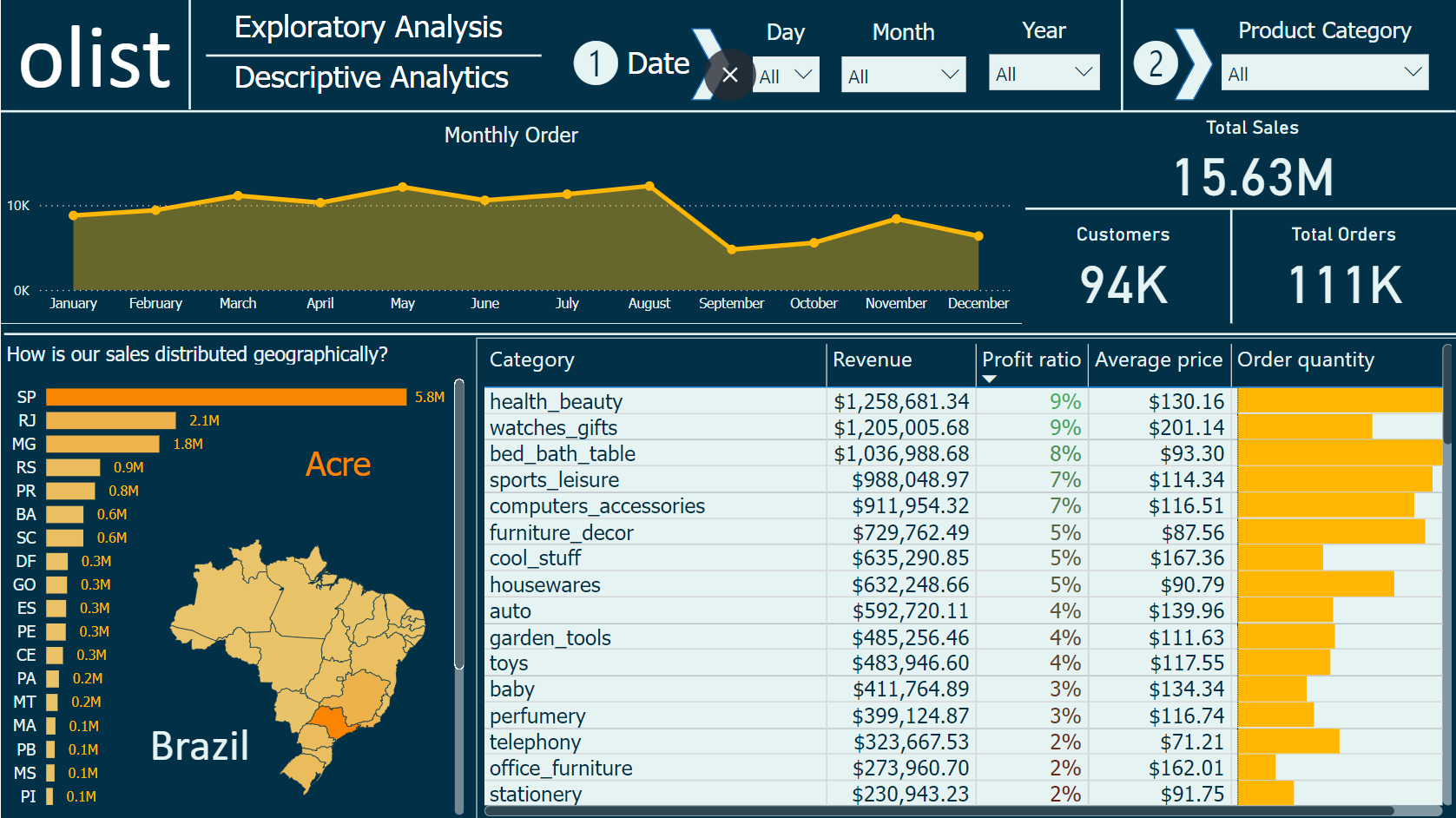
Descriptive Analytics Dashboard
The table graph categorizes products by average price, total revenue, profit ratio, and quantities ordered. The “health and beauty” category tops the list, generating $1.2M in revenue with a 9% profit ratio. This is no surprise, as fashion spending is high among females.
Also, on this page, we can see approximately $16 million in sales, 94,000 customers served, and over 111,000 orders processed.
Customer Investigation Dashboard Link to heading
Every business needs to know about new customers. Customers drive growth, and without them, sustaining progress is tough. This page highlights nearly 100,000 customers. Looking at the visuals, most new customers join between May and August over three years. Preferred payment methods are credit card and boleto payment.
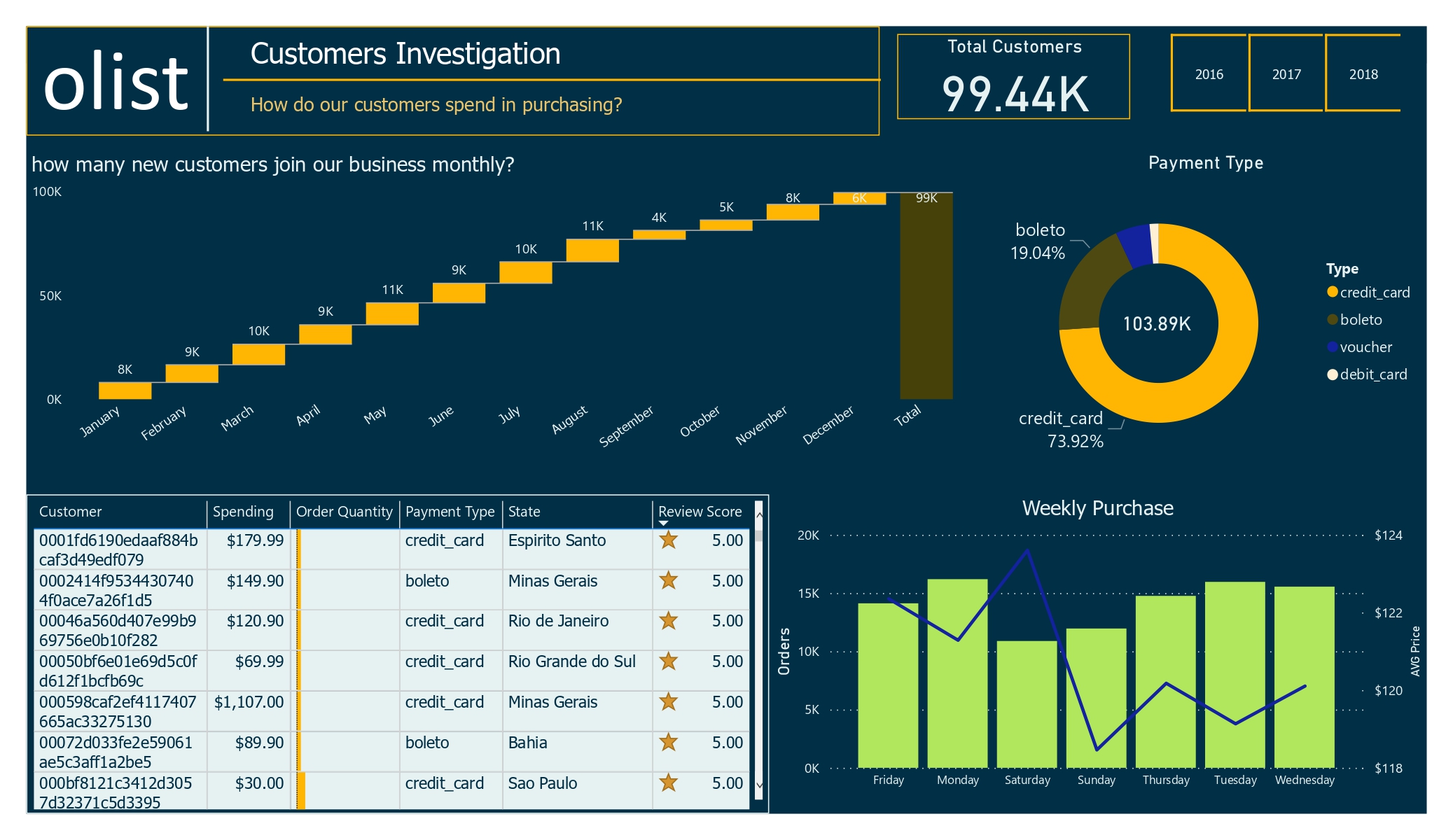
Customer Investigation Dashboard
Customer Satisfaction Dashboard Link to heading
In this dashboard, the average rating is positive, at 4 stars from about 99.5k customers. However, December shows a drop in orders after a slight increase three months prior.
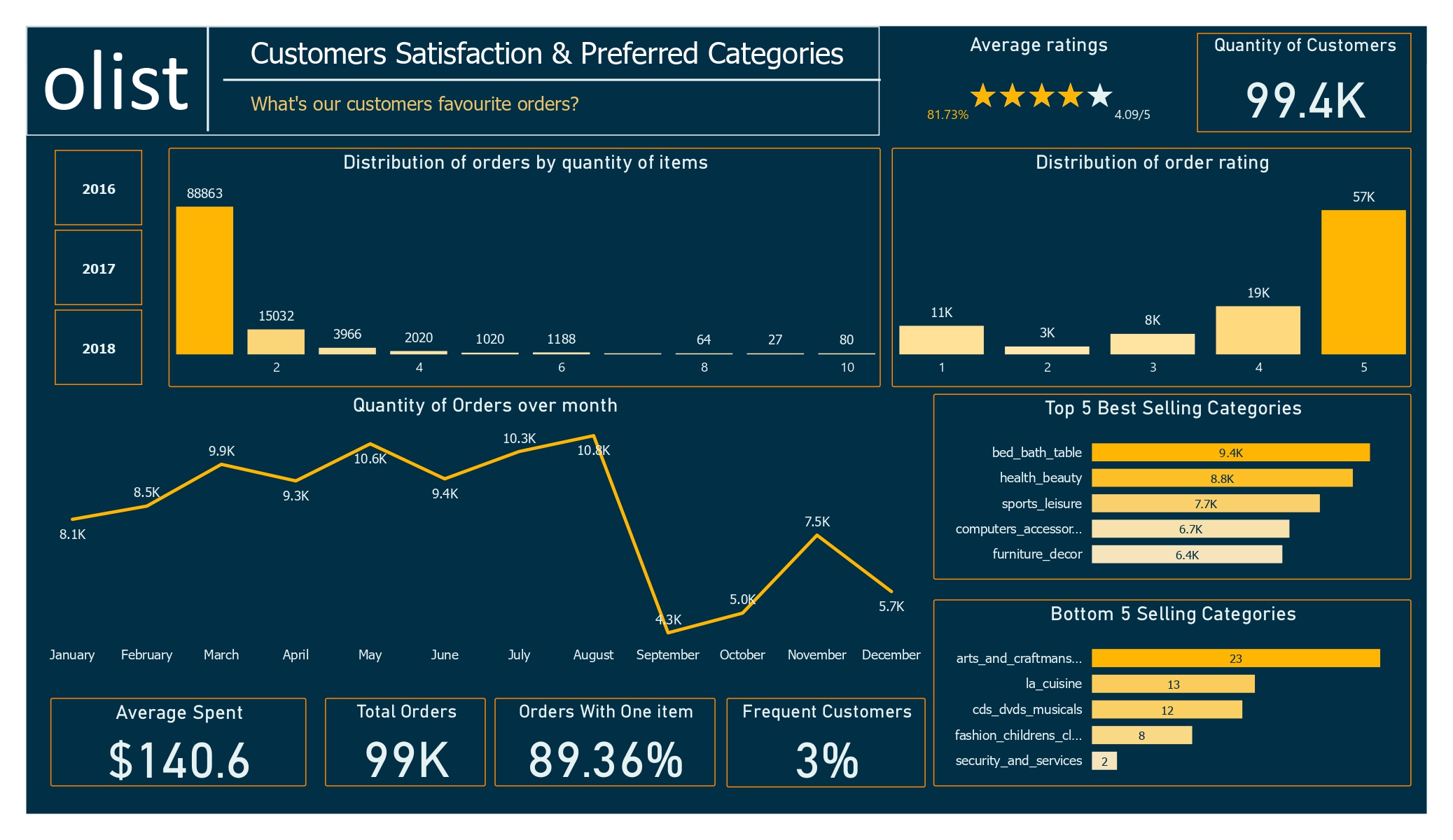
Customer Satisfaction Dashboard
The top five categories have about 40k orders out of 99k total, while the bottom five haven’t exceeded 60 orders. This shows a clear difference in product popularity.
The recurrent customer ratio dropped by 1% compared to the previous two years, likely due to a surge in orders last year. There’s no solid evidence of declining loyalty. Here’s the reference to the formula used for calculating the recurrent customer ratio:
recurrent customers ratio = CALCULATE(DIVIDE([recurrent count], [count customer(unique )]))
Delivery Days Dashboard Link to heading
The delivery page provides insights into the delivery process from seller to customer. The freight value seems reasonable, with 96.4 orders delivered out of the total, even with cancellations.
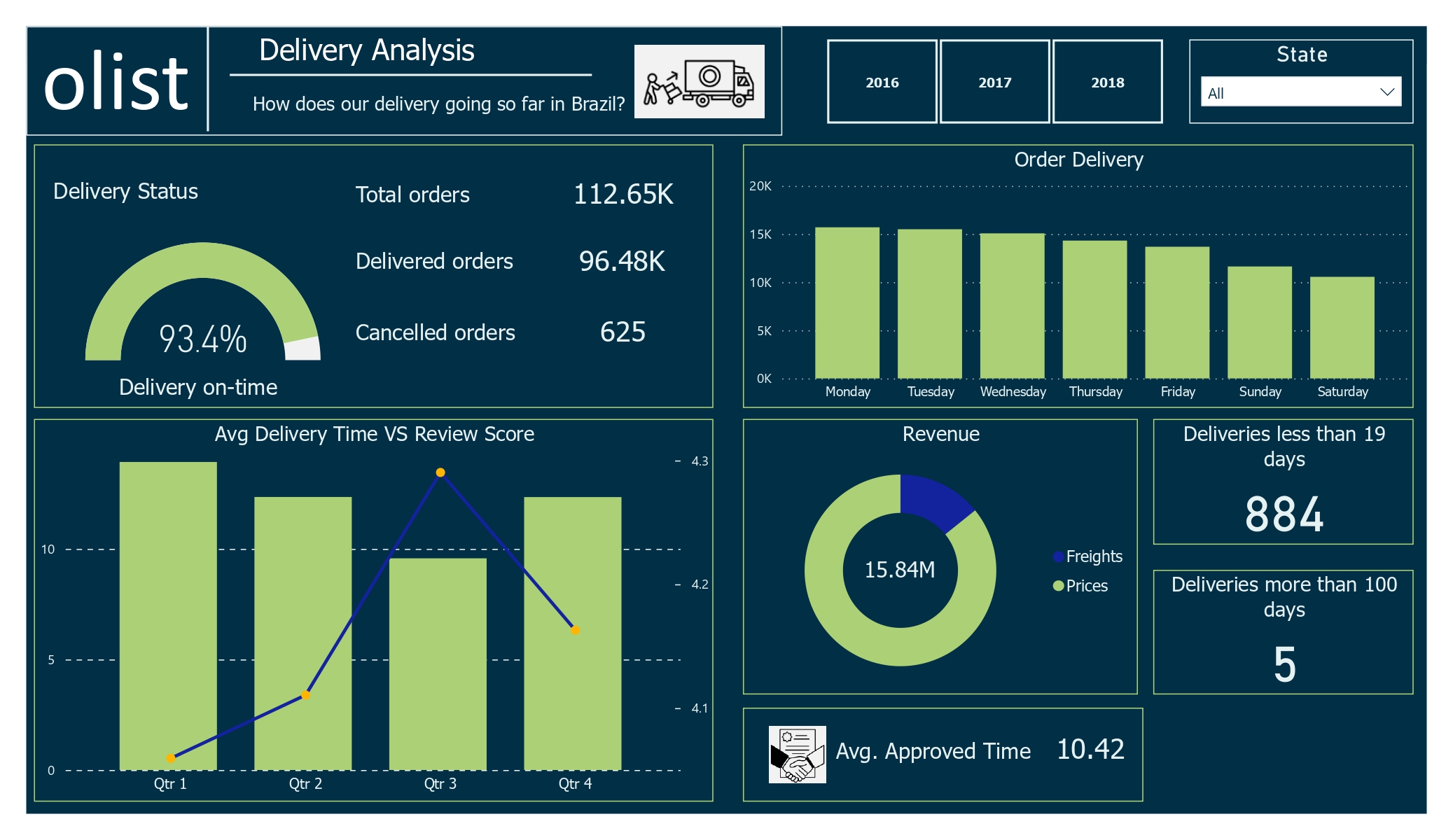
Delivery Days Dashboard
The average review score is lower in the first quarter, possibly due to longer delivery times. In contrast, the third quarter has higher review scores despite shorter delivery times.
Forecasting Dashboard Link to heading
The forecast looks promising, with the higher order quantities in all three years and optimistic predictions for new customer acquisitions.
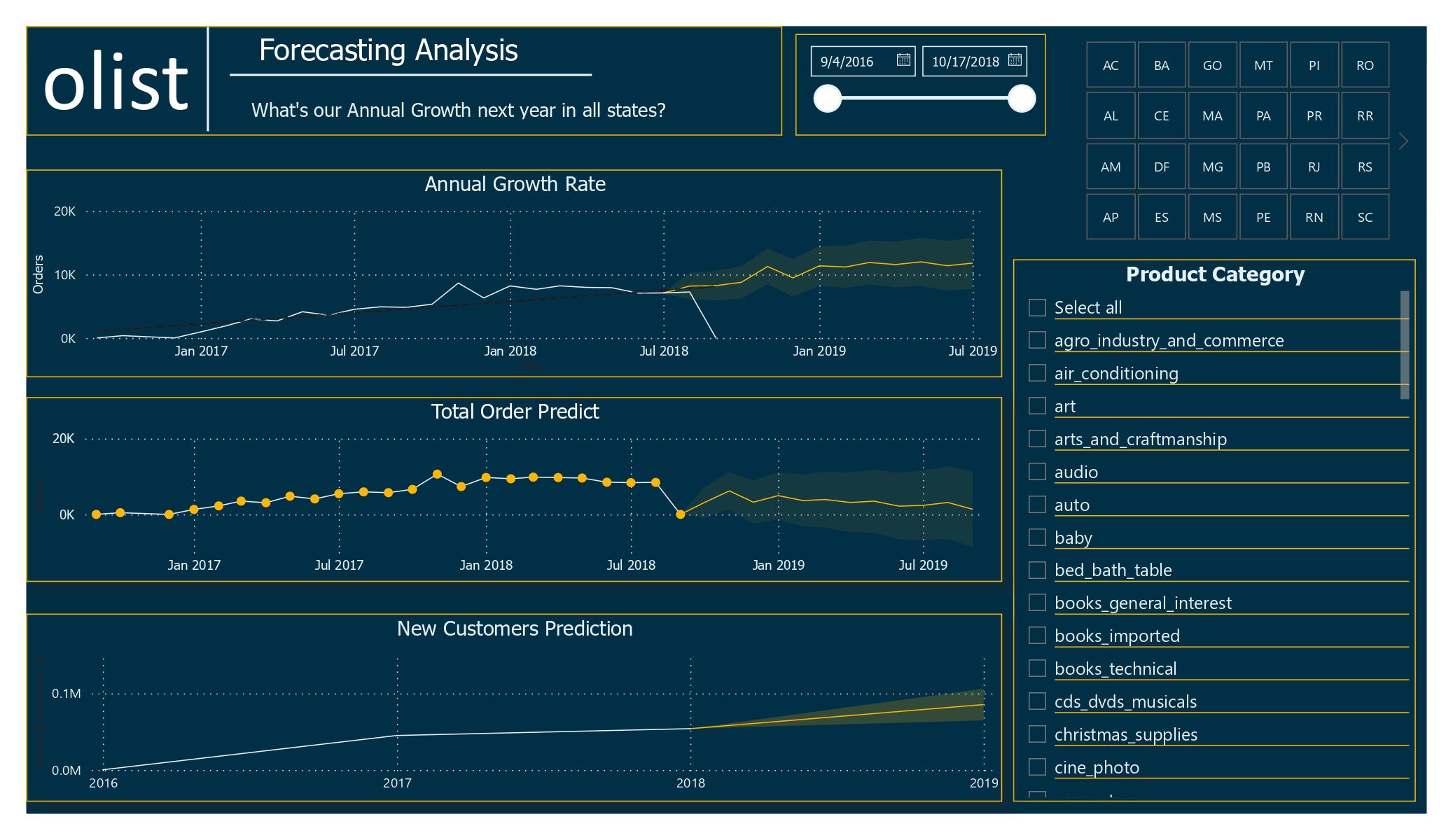
Forecasting Dashboard
Insights Link to heading
Olist has a delivery success rate of approximately 85%. This indicates some challenges within the delivery process, necessitating an investigation into the causes of undelivered orders and efforts to improve this rate. Potential areas for investigation include:
- Efficiency of logistics and fulfillment processes
- Reliability of transportation partners
- Issues with the quality or accuracy of orders being placed
Olist enjoys high overall customer satisfaction, evidenced by numerous positive reviews and high scores. However, the “Security and Services” product category receives the lowest ratings, suggesting a need for improvement in this area.
Recommendations Link to heading
Monitor and analyze customer reviews regularly to identify trends and areas for improvement. This could involve using data analysis tools to identify common themes in customer feedback and using this information to make changes and improve the customer experience.
Investigate Undelivered Orders: Analyze the undelivered orders to identify patterns or factors contributing to delivery failures. Consider whether specific regions, customer demographics, or types of products/orders are more prone to delivery issues.
Communicate with customers about the delivery process. Olist should be transparent with customers about the delivery process and provide them with regular updates on the status of their orders. This will help to build trust and create a positive customer experience. It will also give customers the opportunity to provide feedback on their experiences with the delivery process, which can be used to identify areas for improvement.
Maintain Quality and Responsiveness: Continue delivering high-quality products and services while being responsive to customer feedback. Regularly monitor the delivery success rate and communicate any changes or improvements in the process to customers.
Suggestions: Link to heading
- Special Offers During Low Sales Periods: Implement promotions or special offers to boost sales during traditionally low periods.
- Improve Low-Selling Categories: Invest in advertisements or promotions for bottom-performing product categories to increase visibility and sales.
- Outsource Drivers During Peak Periods: Hire additional drivers during sales or festival periods to ensure timely deliveries and manage increased order volumes
- Review Partnerships: Investigate and potentially revise partnerships with companies that receive low review scores to ensure consistent service quality.
- Analyze Customer Feedback with NLP: Utilize Natural Language Processing (NLP) models to analyze customer comments and reviews in the dataset. This can provide deeper insights into customer sentiments and highlight specific areas needing attention.